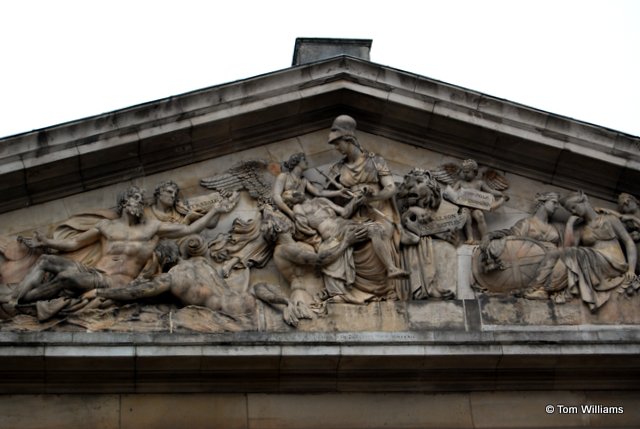
Last week was the anniversary of the Battle of the Nile back in 1798. Nowadays we associate Nelson so firmly with Trafalgar that his other victories can be overlooked. Back in the early 19th century, though, the Nile featured prominently on memorials like this one at Greenwich.
Memorial Arch to Nelson at Greenwich Hospital
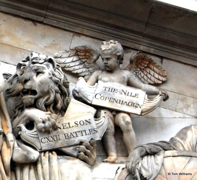
Detail of cherub on arch
As with many battles, the name isn’t geographically accurate. The battle of the Nile didn’t actually take place at the Nile but at Abū Qīr Bay near Alexandria. Napoleon had invaded Egypt, his troops travelling in an enormous French fleet. After the troops had been successfully landed, his warships remained on the Egyptian coast ready to protect his lines of supply. They moored near the shore in the shelter of the bay.
Conventionally, naval battles were fought broadside to broadside, one ship against another. The French fleet was immensely strong. L’Orient, the French flagship mounted 118 guns. The French anchorage meant that the ships’ broadsides were facing out to sea, allowing an enormous concentration of fire to be brought to bear on any force attacking from the Mediterranean.
The British fleet that discovered the French lying at anchor was, on paper, vastly inferior. However, the British realised that the French had anchored slightly too far out into the open sea, allowing a channel between their line and the shore. The British split their force, some ships sailing between the French and the shore while others sailed between the shore and the open sea. With an onshore wind, the French were unable to manoeuvre away from their anchorage and the British sailed slowly down the line, each French ship being engaged one after the other by at least two British ships firing simultaneously from both sides.
The tactic was overwhelmingly successful. Of the 13 French ships of the line, nine were captured and two destroyed. No British ships were lost.
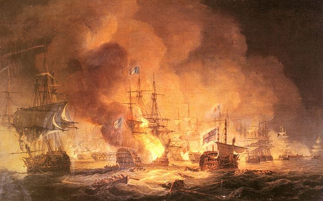
The most dramatic moment of the battle was the loss of L’Orient which caught fire and exploded when the flames spread to the powder magazine. The Captain’s young son had been ordered by his father to stand at his position until his father told him to move. His father having died, the son is said to have remained on deck and died. His death is commemorated in the poem, Casabianca:
The boy stood on the burning deck Whence all but he had fled.
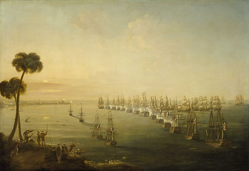
Battle of the Nile, August 1st 1798 at 10 pm, by Thomas Luny
After the battle, the British had complete naval dominance in the Mediterranean. With his lines of supply cut off, Napoleon’s plans to use Egypt as a jumping off point for further invasions were in disarray. Napoleon fled back to France the following year and the French army lingered on in Egypt until surrendering to the British in 1801.
Burke and the Bedouin
The Battle of the Nile is the climax of Burke and the Bedouin. William Brown is on board, the Orion, one of the British ships, and witnesses L’Orient’s sinking.
“It’s the Orient… The Orient is ablaze… The Orient is sinking.”
An officer appeared. “All hands on deck!”
Confused, William joined the procession of seamen clambering onto the deck. The night was still warm, but after the atmosphere of the gun deck, it was bliss to breathe fresh air.
Out here, the view was dominated by the blaze from the Orient. Sales and rigging were well alight and the spars were dropping onto the deck. Flames could be seen running along the joints between her timbers, where they had been sealed with tar. Here and there, the fire had spread to the timbers themselves. Against the light, the crew could be seen desperately throwing water onto the fire, but many had clearly already given up hope and were shimmying down ropes to escape into the sea.
“Stop gawping! Start dousing the deck.”
Buckets of water appeared, passed hand-to-hand up ship from the bilges or hauled to the deck from the sea below. While most of the men from the gun deck poured the water over the timbers at their feet, the crew who had been manning the sales aloft hauled buckets from the deck and soaked the canvas and ropes.
William could not understand the reason for this frantic activity, but it became all too clear after they had been at work for only a few minutes.
William had his back to the Orient when it happened. The night was lit up with a brilliant flash of light and, while his brain was still trying to comprehend what he had seen, the noise of the explosion rolled across the ship. William felt himself pushed forward by the force of the blast.
“Get down!”
William fell to the deck, along with the rest of the crew.
Debris from the wreck flew across the ship. Pieces of hot metal scoured tracks in Saumarez’s immaculate deck. Pieces of the Orient‘s hull – two yards long and three feet thick – were hurled at the Orion as if they weighed no more than pieces of paper. There was other debris too – things William did not want to look at too closely. Most of the bodies were in pieces too small to be recognised as human, but William saw what was clearly an arm, the fist still clenched, although whatever it had been holding was lost somewhere in the Mediterranean.
Like all the Burke books, Burke and the Bedouin is first and foremost a spy story. But I wanted to describe one of Nelson’s greatest victories for a generation that has no longer grown up with the tale. There are French spies and a beautiful woman and midnight gallops across the desert, but the story ends with the historical reality of the Battle of the Nile and the end of Napoleon’s dreams of conquest in the east.
Header picture
The picture at the top of the page is ‘The Battle of the Nile, 1 August 1798‘ by Nicholas Pocock.
I’m not a huge fan of Romantic Fiction, so the blurb for this book was not enticing:
Jane thinks he sees her as shallow and ill-educated. Theo thinks she sees him as a snob, stuffy and out of touch. Within the ancient precincts of the university the first encounter between the conference planner and the academic is accidental and unpromising. Just as well there’s no reason for them ever to meet again.
It looks like the beginning of every trite and predictable chicklit romance. “My god, Jane, with your glasses you look quite intelligent.” “And you, Theo, once you’ve had a style makeover, could be the man of my dreams.” But I have “met” Gilli Allan online and I know how much she puts into her books which she prefers to think of as “contemporary women’s fiction” rather than Romance. So I snuck a copy onto my Kindle and decided to find out just how bad it could be.
And the answer is: not bad at all. In fact, it’s rather good. Her characters are properly realised with back-stories that are entirely credible and rather sad, but both Theo and Jane are trying to move on with their lives and overcome their emotional issues. They are active and engaging agents in their own lives, rather than the creations of a writer who knows that the path of true love can never run smooth until the lovers have overcome one or two largely imaginary obstacles to their happiness. In fact, neither Jane nor Theo is “looking for love”. Indeed, both are actively fending off unwanted suitors while concentrating on making successes of other aspects of their lives.
Jane is starting her own business as a conference organiser and Theo is trying to climb the academic ladder as an archaeologist. Gilli Allan knows a lot about both conference organising and archaeology and the details of the lives of the two protagonists are interesting and convincing.
As their work means that they begin to run into each other more and more often (she is organising a conference at the Cambridge college he is working at) so an unlikely friendship forms. Will it blossom into love, or will one of the various other potential romantic partners derail the affair before it has even started?
Gilli is a member of the Romantic Novelists Association, so a happy ending is more-or-less guaranteed. (One of the reasons I generally dislike Romantic Fiction is because most readers and writers consider that a happy ending is required.) Even so, I was not sure things were going to work out. The characters are complex, the back-stories elaborate. The story is told in the present tense, an affectation that usually annoys me but which works here because it delineates the main story from the quantities of back-story (past tense) that could otherwise get very confusing. There’s also quite a lot of plot. Actually, there are so many sub-plots I began to lose count, though I was never confused. All the characters, even the most minor, are clearly drawn so that even I couldn’t muddle them up. And Gilli keeps the plots so interesting. One rather important one centres on some sharp practice in a town planning department and the provision that should or shouldn’t be made for an archaeological survey before a supermarket is built. I’ve sat in on the odd local government planning controversy and it takes real skill to make them remotely interesting, but Gilli Allan does.
I’ve found this a difficult book to review because there is so much good stuff in it, but it seems to be scattered all over the place. It is a measure of the author’s skill that she manages to pull so many disparate strands together into a highly readable and wholly enjoyable book.
I do strongly recommend this, even if you hate Romantic Fiction.
If you read my Facebook author page (https://www.facebook.com/AuthorTomWilliams) you will already know that this is quite a busy time. I’m popping up on blogs all over the place, mainly because I’ve just republished Burke and the Bedouin. And this week the Historical Writers’ Association working with Sharpe Books, have published a short story collection, Victoriana, that has a story by me in it.
Honestly, there’s so much I’d like to talk to you all about but there’s one thing that’s important enough that I should just concentrate on this. As of today, Burke in the Land of Silver is available for just 99p ($.99 in America). It’s a special deal to encourage you to read the first in the series as I republish the original three books about James Burke and add two more new ones. The offer only runs one week and Amazon won’t allow me to repeat it for a little while, even if I wanted to. So buy yourself a copy now while it represents even more spectacular value than usual.
David Klass has a background in Young Adult (YA) fiction. As far as I’m concerned, this is good thing. YA fiction grabs your attention. Plots are usually fast moving. Characterisation is far from two-dimensional, but the reader is usually spared angst-ridden internal monologues. There is often a subplot involving a contemporary social issue, but the protagonists are pretty much left alone to get the job done – whether it’s rescuing the Princess from the tower (or, because YA novels tend to political correctness, rescuing the Prince from the tower) or stopping the terrorists with the atomic bomb.
Klass has brought all these skills to Out of Time and the result is a fast, furious, and, for me, satisfying read. Although it should definitely appeal to adults, I did often feel that I was reading a YA book. Our hero, Tom Smith, is an FBI agent with father issues (YA novels often feature young protagonists with father issues) who has joined the FBI as a computer analyst but, as seems the way with these things, rapidly graduates to a field agent hunting down bad guys with gun and badge.
The bad guy is an eco-terrorist who has been blowing up environmentally damaging projects (with a bit of political assassination on the side). But is he really a bad guy? After all, he may kill the innocent men, women and children who are in the wrong place when one of his bombs goes off, but he’s doing it for a good cause, right?
It’s a superficially appealing argument, but it is wrong. In fairness Klass understands this and has one of his characters put the case against political killing very directly.
“Every terrorist thinks his cause justifies his actions. No one has the right to take the law into his own hands, and especially to spill innocent blood. Anyone who does that must be stopped.” He paused and then asked softly, “But, Lise, what if in this single very unique case, Green Man happens to be 100% right?” There was a deep seriousness in her face when she answered. “I served two years mandatory military service in Israel. I’ve been to bomb sites, from attacks on opposite sides of the same issue. I’ve used tweezers to pick up blown apart little pieces of women and children. Nothing justifies fanatical extremism. Nothing. Never.”
This is a problem for the book because part of the dramatic tension is that we are ambivalent about the Green Man getting caught. Part of us wants him to get away with murder and return safely to his loving wife and two adorable children. We feel this even more strongly as occasionally the book works in details about the environmental disasters that we are unleashing on the world. Some of this is genuinely informative. For example, I had never realised that the process of fracking releases methane on a large scale and this is simply discharged into the atmosphere where it is a particularly potent greenhouse gas. If you started out knowing nothing about the environmental movement, you will end up much better informed – but would you really want to read a book which celebrates an eco-terrorist if you are not already pretty committed to his cause?
If you want a work of fiction that seeks to educate on environmental issues, you would be better off going to something like Michael Crichton’s State of Fear, which also deals with eco-terrorism. The arguments there are widely regarded now as wrong (Crichton was sceptical about global warming, for example) but he does provide footnotes and references and if you are proselytising quite as much as Klass is, then footnotes, or at least a long appendix, might be a good idea.
In the end, though, it’s unfair to judge this book as a substantial work dealing with either ethics or environmentalism. It’s fast moving, and largely convincing, with an environmentalist background and a bit of ethical discussion thrown in. I loved it and powered through it very quickly. (Klass has an easy writing style.) But I do really enjoy YA novels. Judged as a YA book, this is a definite winner and many adults will appreciate it as an exciting read. As an adult discussion of serious issues, though, it’s not really careful or considered enough.
I do hope you’re not getting bored about book covers. My essay last week didn’t get nearly the attention that was given to Anna Legat’s views on cover design back in May but maybe it was me rather than the subject matter. Let’s hope so, because this week with have Gilli Allan with her take on covers.
Book Covers are an Art in Themselves – A subjective view
There is only one book I recall buying because of its cover. I was twenty and browsing in Menzies, on the Strand in London. Black with a pale gaunt face looking out, the cover remains a strong visual memory. (Inexplicably I can find no trace of it online!) Intrigued, and entirely at a loss which name – Titus Groan or Mervyn Peake – was the title and which the author, I picked it up from the shelf. I’m not a fan of fantasy, but Mervyn Peake’s masterpiece, the Gormenghast trilogy, became an obsession and remains one of the stand-out literary experiences of my life.
Covers can be misleading, though. As a young woman I can easily recall my outrage when a novel adorned with a pretty blonde in a crinoline, turned out to be a Regency tale of a dark-haired heroine. Or worse, when the hero proved to be a bearded redhead, but the handsome chap on the cover had been dark and clean shaven. It was just WRONG!
Now I never choose a book because of its cover. Which isn’t to say I don’t judge. There are covers I like and covers I definitely don’t. Those that make me pause and look twice are covers whose message is unclear. Anything enigmatic or atmospheric, or quirkily symbolic, or dominated by particularly magnetic colours, is far more likely to catch my eye. Will that be sufficient to make me buy? No. I have reached an age when I only read what I know I will like!
Am I lazy? Prejudiced? Intellectually unadventurous? Blinkered? Maybe all those things. I pick my reading from a list of authors I already admire, or from reviews on Arts programmes and newspapers, from word of mouth and from award-winners in favourite genres. I don’t even read blurbs because I prefer to be surprised! I certainly pay no attention to the covers.
My all-consuming hobby as a teenager was writing, but I would not show my soppy ramblings to anyone other than the two friends I insisted listened to my stories. Art was my best subject at school, and though English came second in enjoyment, my returned homework rarely received more than a B and the quantity of red scribbled corrections convinced me I was no good.
I stopped writing when I went to art school. It was only after a career of more than ten years as an illustrator in advertising that I decided to try writing again. This was not in response to a sudden creative flowering. After becoming a mother, I didn’t want to return to the hassle and stress of work! Writing proved to be an occupation I could easily fit around being a stay-at-home-mum. The biggest bonus of that decision was the joy I discovered in revisiting my “soppy” hobby.
My first two novels swiftly found a publisher. The pre-digital Love Stories – characterized at the time as “The thinking woman’s Mills & Boon” – was a new enterprise, only too willing to take me up on my grandiose offer to provide the cover artwork. Though I knew precisely nothing about the discipline, I was undaunted. I came up with an illustrative water-colour image for both the covers of Just Before Dawn and Desires and Dreams.
From that high-point my expectations of a glittering career began a slide into a long and humbling period of lesson-learning. Whether or not my covers bear any responsibility for my poor sales is unknowable, but Love Stories did not prosper and when they went out of business, I failed to find another publisher.
Perhaps I should have taught myself book cover design in those in-between years, but commercial art and design had moved away from the tools I was familiar with to computers. It was only when the digital revolution came for books as well as art, that I decided to self-publish the three novels I’d written in the interim. With a lot of trial and error, I managed to produce cover designs I was happy reflected the content of the books. But the demands of constant marketing and promotion was a burden. When the opportunity arose to join the small publisher, Accent Press, I happily sold myself.
For the first time I confronted the reality of my covers being out of my control. I leave it to you to guess whether I was pleased with the covers I was given. TORN – about a woman living in a small end-of-terrace cottage on the side of a wooded hill. FLY or FALL – about a woman living a suburban life in a suburban town. LIFE CLASS – designed using a stock image I found – is the only one of my Accent Press covers that I actually feel reflects the story.
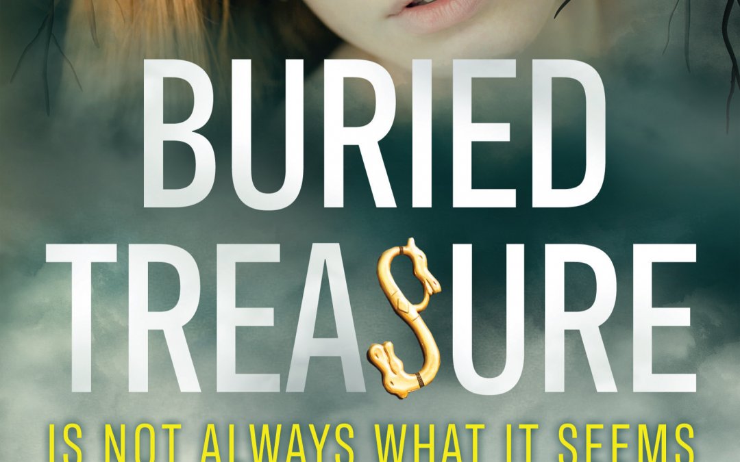
On deciding to self-publish my next book, I was again faced with the “cover” dilemma. Unable to find suitable stock images, I came up with a graphic design which was symbolic of the themes of my book. (It’s the picture at the top of this piece.) Though based on archaeology, Buried Treasure is a story about much more than digging up valuable objects. But I was never entirely satisfied and after publication almost immediately set about the task of redesigning its cover so that I could have a mini relaunch when the book went into paperback. I eventually managed to create a cover I was thrilled with but everyone in the business awarded it a thumbs-down. It looked less like a book about relationships (with a hint of mystery), and more like a thriller, apparently!
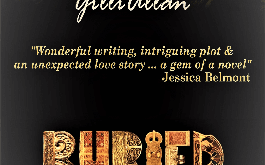
Back to the drawing board. Only this time it wasn’t my drawing board. I decided to accept the advice I was being given from all sides. Just because I am not much influenced by cover design when I make a choice to buy, I can’t deny the evidence that a majority are. Good cover design is not just the ability to assemble a pleasing image alongside the necessary information. It is a skill that has more to do with advertising, with identifying a brand and selling a product, than it does with “Art”. Though I did work in advertising, I was more of a workhorse than a visualizer or salesman. My ability to identify my buyer and hone my message to appeal to him or her is zero. By handing the project over to a professional, Cathy Helms of Avalon Graphics, I hope this time, I have got it right.
GILLI ALLAN
Living in Gloucestershire with her husband Geoff, Gilli is still a keen artist. She draws and paints and has now moved into book illustration.
All of her recent books Torn, Life Class, Fly or Fall, and Buried Treasure have gained ‘Chill with a Book’ awards.
Following in the family tradition, her son, historian Thomas Williams, is now also a writer.
Jane thinks he sees her as shallow and ill-educated. Theo thinks she sees him as a snob, stuffy and out of touch. Within the ancient precincts of the university the first encounter between the conference planner and the academic is accidental and unpromising. Just as well there’s no reason for them ever to meet again. But behind the armour they’ve each constructed from old scars, they’ve more in common than divides them. Both have an archaeological puzzle they are driven to solve. As their stories intertwine, their quest to uncover the past unearths more than expected.